Reference

Summary
- When the structure reduces the burden of decision-making, it becomes easier to contact.
- When the next step is visible, uncertainty does not interrupt your business.
- When the digital experience matches the promise of service, building trust doesn't get halfway done.
Customer
Industry
Care services
Keywords
Web Design
UI Design
UX Design
Webflow
Analytics
Valokuvaus
Websites did not support our customers' everyday path
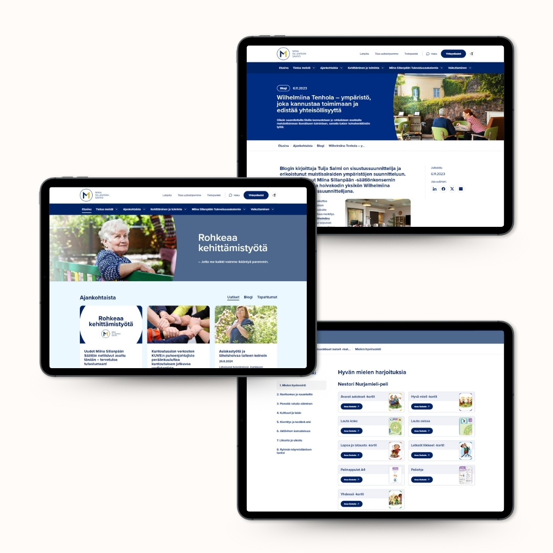
Owned by Miina Sillanpää Foundation Owned by Wilhelmiina Palvelut Oy, it provides homes and rehabilitation for elderly people in Helsinki's Pikku Huopalahti and Ruskeasuo, and its mission is to create a safe, reliable and accessible everyday life for older people. Customer orientation, clarity and accessibility are at the heart of our operations.
Wilhelmina's previous site functioned technically, but in the opinion of the Wilhelmina services representative did not respond to the target group's usage situations by requiring too much energy to find answers. When the target group is the elderly and their relatives, energy is then the wrong currency.

In practice:
When a user group includes older people and visitors who take advantage of screen readers, the structure cannot be a compromise. It must be consciously designed.
- Font sizes and contrasts did not serve the elderly optimally, but slowed down reading.
- The content was visually heavily condensed, which increased the reader's cognitive load.
- The mobile experience was poor, and navigation did not lead clearly to the next step.
- The visual look was outdated and did not support the reliability or intelligibility of the brand.
A strategically built and genuinely achievable solution
In care services, trust does not arise by chance, and decision-making is not impulsive. Confidence and confidence are built in everyday life. And more and more often digitally as well.
When the target audience is older people, their families and public actors, a website should not be a mere marketing channel. It's part of the service promise. Part of accessibility. Part of accountability. This makes our project with Wilhelmina concrete: each decision was tied to one question: Does this make it easier for the user to progress?

We didn't just set out to “revamp the look.” We set out to remove barriers to transition.
With the website accessibility audit and SEO mapping, the site was designed according to the customer's wishes in accordance with the user understanding above. Typography, contrasts, and interface proportions were defined to support readability and accessibility in accordance with accessibility standards across all terminals.
When designing the layout, we wanted to bring freshness to the site as well as a visual connection to the Miina Sillanpää Foundation, whose site we had just renovated before. Read more about the reform from here.
Navigation was clarified to the essentials and the structure of the site was made easier to understand. Contact is constantly available and opens without additional transitions. The contents were structured into manageable entities, and information essential to everyday life, such as the weekly calendar, was brought directly to the page instead of PDFs. The services of two different units — Taavet and Tenhola — were combined into one distinct entity.
As part of the revamp, the technical implementation was moved to the WebFlow publishing platform, allowing for smooth maintenance and continuous development without burdensome update processes.
A clear improvement! The new site looks really fresh. Webflow is also more intuitive as a platform and can do more.
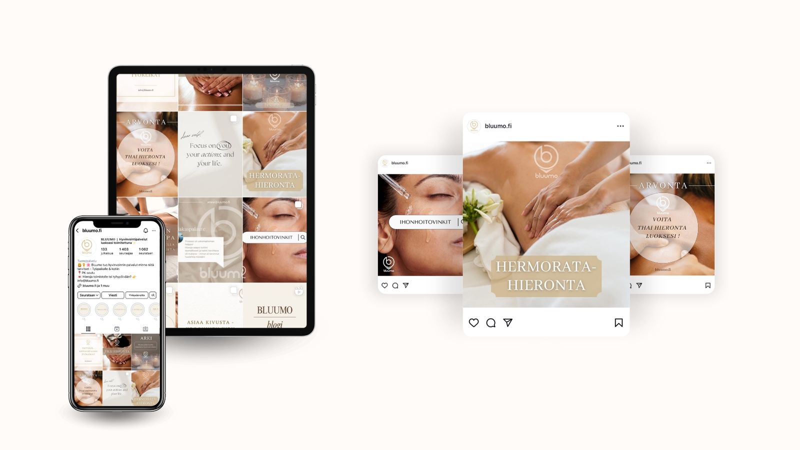
Päivitetyllä kuvapankilla arkea paremmin esiin
Verkkosivu-uudistuksen jälkeen asiakkaalla ilmeni tarve päivittää kuvamateriaalia. Koska kyseessä on ikäihmisille suunnattu palvelutalo, kuvien ajantasaisuus ja monipuolisuus korostuvat erityisesti.
Kuvaajamme vieraili kohteessa ja tuotti laajan kuvapankin erilaisiin käyttötarkoituksiin. Kuvauksissa huomioitiin muun muassa ravintola-, kokous- ja liikuntatilat, ryhmäkodit sekä senioriasunnot. Otoksista valittiin parhaat, jotka viimeisteltiin huolellisesti eri käyttökohteisiin sopiviksi.
Sivustolle toteutettiin selkeä ja visuaalisesti houkutteleva kuvagalleria, joka esittelee Wilhelmiinan palveluita, tiloja ja arkea. Galleria mahdollistaa kuvien suodattamisen esimerkiksi tilojen tai huonetyyppien mukaan, jolloin vierailija löytää helposti itseään kiinnostavan sisällön. Tutustu kuvagalleriaan täältä.

The site now supports the actual use of Wilhelmina's services — not just communication about them.
When the structure is in order, the user is not left looking for the next step and taking the next step does not break with uncertainty.
Check out Wilhelmina's website that exudes warmth and confidence here.


Check out our website and digital presence.
With high-quality updated websites, you increase your credibility, improve your customer experience and bring out the best in your brand. Optimized in terms of user experience and functionality, the site supports your business every day.
Behind the reference


.jpg)


.jpg)
.jpg)